Data Visualization: Translating Data So It Can Be Democratized
Why data visualization is essential to building a data-centric organization
Add bookmark

What is Data Visualization?
Data visualization (DV) refers to translation of numerical or statistical information into a visual or pictorial format (i.e. map or graph). As images can be more intuitive than words or numbers, this process makes it easier for humans to identify and derive meaning from trends, patterns, and outliers found within the data.
In other words, it is where data science meets design. The primary objective being to create "a visual metapor" that not only accurately communicates data-driven insights, but also ensures they are easily understood, remembered and acted upon.
Chances are you come across examples of DV on a daily basis. Everything from simple pie charts embedded into Excel sheets to heat maps you might find in a news article to more complex infographics fall under the umbrella of data visualization (DV). For example:

John Hopkin's Covid-19 Heatmap, https://coronavirus.jhu.edu/us-map
Finding the Worst, Highest-Paid NBA Player Ever by Pudding, https://pudding.cool/2019/12/real-mvp/
For the data scientist, data visualization is a powerful tool for communicating large, complex and esoteric data sets to business leaders and other non-technical data consumers (i.e. front line staff, customers, etc.). Instead of simply displaying metrics, data visualization enables data scientists to craft a compelling narrative around the data - a process known as data storytelling.
As defined by TechTarget, data storytelling is “the process of translating complex data analyses into layman's terms to influence a decision or action.” Essentially “the last mile of analytics,” it goes beyond data visualization by providing additional context and meaning.
David McCandless, renowned data journalist and speaker, share how he approaches "Making data into art," https://informationisbeautiful.net/visualizations/making-data-out-of-art-a-short-film/
Data visualization techniques have been used to change mindsets and behavior for over a century, especially in the field of public health. Florence Nightingale, the legendary wartime nurse, was actually a pioneer in the field of the graphical representation of statistics. Her “rose diagram” changed the course of history by making the case for the routine sterilization of hospitals, a practice that has since saved countless lives.

Though DV can illustrate all types of data sets and insights, in one way or another, it is most commonly used to highlight:
- correlations in relationships
- frequency of occurrence
- changes over time
- risk and reward
- market trends and opportunities
- network analysis
- distribution and demand
What are data dashboards?
Data dashboards, or simply “dashboards” for short, are a subset of data visualization tools that visually track, analyze and display business intelligence (BI) such as key performance indicators (KPI), metrics and other relevant data points to monitor the health of a business, department or specific process. The goal of dashboards are to enable non-technical users to more easily interpret and make decisions using data and analytics.
Analytics dashboards are frequently embedded into bigger enterprise systems, business intelligence (BI) platforms and vertical solutions (i.e. HRMs, financial management systems, etc.) to help users monitor and optimize performance. For example, a call center manager might use a dashboard within Salesforce to track KPIs related to call time, call distribution, resolution rates, etc. Or an HR Director might use a dashboard embedded within a larger HCM system such as Workday to track turnover, diversity metrics or time to hire.

*Image sourced from https://www.salesforce.com/products/service-cloud/features/service-analytics/

*Image sourced from https://www.workday.com/en-us/products/analytics-reporting/human-capital-management-core-reporting.html
Though some embedded dashboards are customizable and can integrate data from multiple systems, most are really only useful when it comes to displaying information within a single focus area (i.e. marketing, finance, HR, etc.). For those looking to harness the power of enterprise data and analytics - whereby organizations collect, combine and analyze data from all or most functions of the business - a horizontal data analytics or visualization tool is typically required.
Types of Data Visualization Solutions
Standard Data Visualization Solutions
Graphic design platforms that enable users to build static visualizations such as those included in news articles, whitepapers, infographics and presentations. While some of these tools are quite user friendly, intuitive and are well-suited for non-technical business users looking to create simple data visualizations such as bar charts or heat maps, others require more technical expertise. Google Charts, for example, requires some light coding for website implementations.
As these are first and foremost design tools, they tend not to offer much in terms of data integration and analytics processing capabilities. The designer simply imports whatever data they want to use and then manipulates it into its final, visualization form. As a result, the quality of the visualization is dependent on the quality of input data as well as the expertise of the designer.
Examples of these tools include Infogram, Datawrapper, FusionCharts and Knightlab.
Visual Analytics Platforms
Tools such as Tableau, TIBCO Spotfire, SAS Visual Analytics, SAP Lumira and Microsoft PowerBI pull together sources from multiple sources and allow non-technical users to build data visualizations. Unlike standard data visualization tools, these solutions include advanced data modeling and predictive capabilities.
In addition to integrating internal data from across multiple functions, these tools also enable analysts to easily pull and synthesize data from external sources. For example, a retailer might combine historical sales data with weather data to build a visualization that predicts in-store sales for the next month. Or a real estate firm might use geospatial data to build a heatmap that highlights new and emerging markets to show their sales team where they should be targeting.
Visual analytics platforms enable users to both develop analytical insights and express them in the visual manner that best suits their needs. As these systems are highly configurable, they can be used to create everything from ad hoc visualizations (such as one might use in a presentation or news article) to general business intelligence dashboards that provide ongoing, real-time reporting.

*Image sourced from https://www.vox.com/2017/7/6/15918914/interactive-chart-self-driving-autonomous-uber-lyft-detroit-silicon-valley-reinvent-car

*Image sourced from, https://www.tableau.com/en-gb/products/dashboard-starters
Though not specifically branded as DV tools, many data analytics and “big data” tools do include advanced data visualization capabilities. For example, Qlik, IBM Cognos and Zoho Analytics all include interactive, self-service DV capabilities that enable the user to design and build their own visualizations.
Common Visualizations Techniques
The ways in which data can be visualized are infinite. While BI reporting dashboards typically leverage more traditional design assets such as bar charts and trend lines, some DV projects call for more complex visualizations such as hyperbolic trees and polar charts. Below are the 4 of the most frequently leveraged graphics.
Pie Chart. Circular statistical graphic, where pie a circle or “pie” is divided into slices to illustrate numerical proportion. Best for illustrating simple proportions, percentages and part-to-whole comparisons. Though pie charts are one of the easily understood graphics, they typically don’t work for more complex, multivariable representations.

Pictorial Unit Chart (a.k.a. pictograph, or picture chart). The use of pictograms – icons or pictures in relative sizes – to highlight data patterns and trends.

Bar Chart. Simple, straight-forward charts that display data using a number of bars, each representing a particular category.they are primarily used to display and compare the number, frequency or other measure (e.g. mean) for different discrete categories of data. Histograms are similar to bar charts except they group numbers into ranges.

Line Chart. Often used to visualize the value of something over time, the line graph consists of a horizontal x-axis and a vertical y-axis. Data points are plotted and connected by a line in a "dot-to-dot" fashion.

And that is only the tip of the iceberg. You can view a full inventory of data visualizations and definitions here.
What Are The Benefits of Data Visualization?
In an age where actioning data-driven insights is paramount to success, ensuring that everyone within an organization not only has access to data and analytics should be a key priority for any forward-looking organization.
However, access is just one piece of the puzzle. Unless non-technical users can easily interpret and apply analytics to decision making, even the best business intelligence will be rendered useless. By making data easy to obtain and comprehend, DV is a key component of data democratization and data literacy.
Last but not least, companies that go one step further and embed visual analytics into their own products reap a slew of secondary benefits ranging from improved customer loyalty to increased profitability. This process, known as “data wrapping,” equips customers with data-driven insights to help them get the most out of the product.
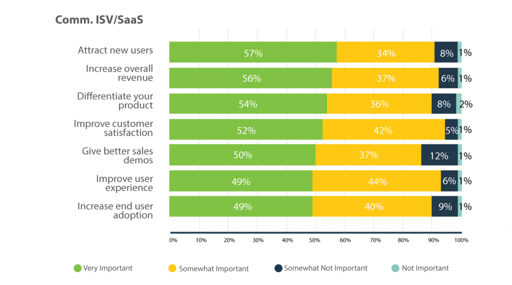
*Image I sourced from https://www.logianalytics.com/definitiveguidetoembedded/the-business-case-for-embedded-analytics/
How is your organization blending data science and design to democratize data and analytics? Take 3 minutes to share your insight.
Create your own user feedback survey